Specification

The two that we will be focusing on for this project is the poster and the film magazine review. But for now I will just be talking to you about the film posters.
The main purpose of a film poster is to advertise an upcoming film, through letting audiences know that a new film is due for release. A film poster provides a lot of information on an upcoming film such as;
- The name of the film
- The release date
- The actors/actresses
- The Certification
Billboards

James Bond's Skyfall is advertised on a billboard this is very effective because billboard are usually placed by very busy roads and streets meaning that everyone will be able to see it. This is a very popular and effective way of advertising a film.
On the side of buses

The dark night is advertised on the side of a bus, this is a very effective way of advertising because buses are everywhere so therefore a lot of people are going to see it and it is also very eye catching so it will attract a lot of people attention. This is a very popular and effective way of advertising a film.
There are many types of posters involved in advertising films. For example, there are teaser posters, character posters and the main poster.
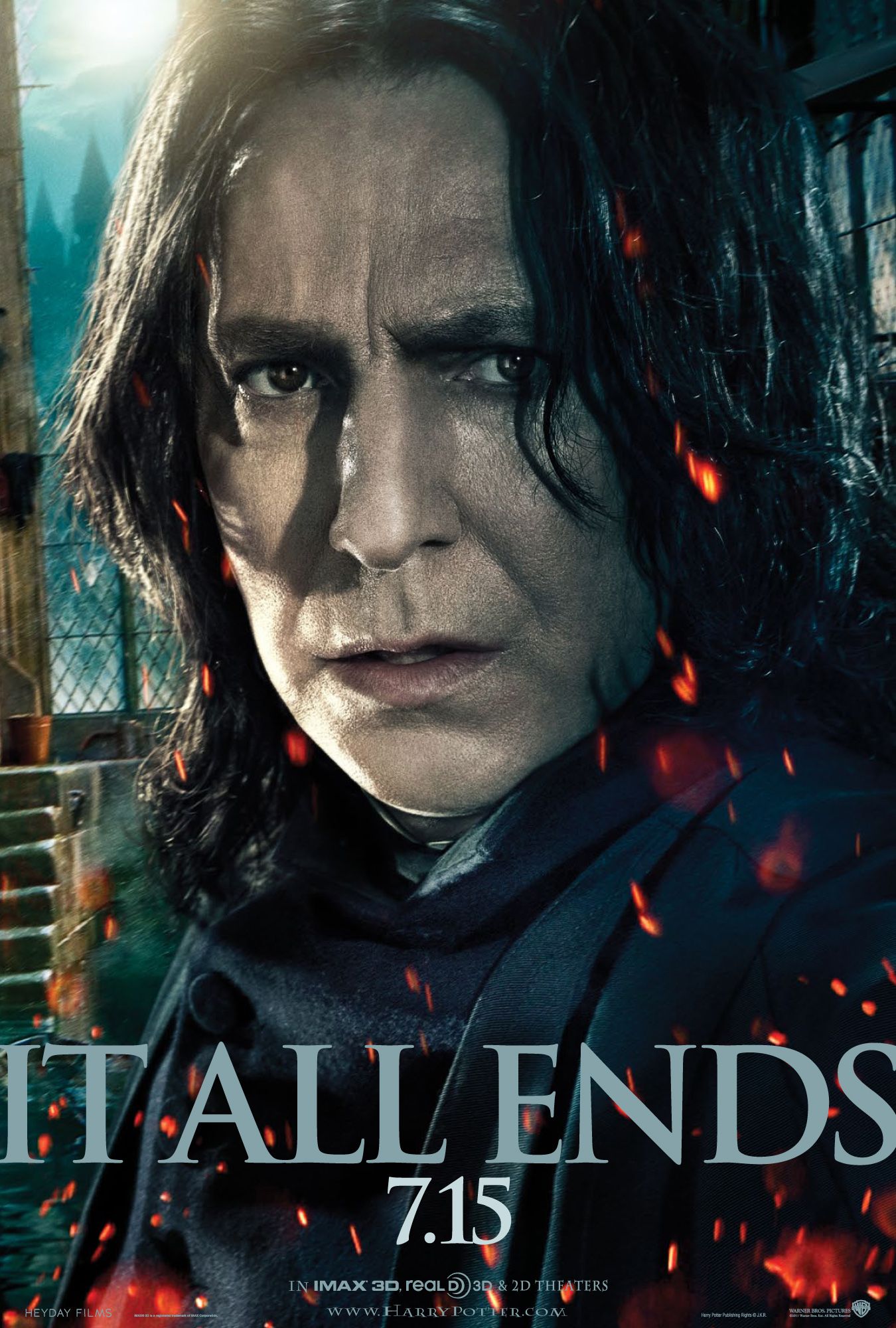
Character Poster
A character poster can feature any of the main character from the film. Here are a few examples from existing films;

Teaser Poster and Main Poster
A teaser poster contains basic information to create suspicion and make you wonder what the rest of the poster is going to be. It doesn't indicate a lot about the plot and it may include a character, object, building and a date of when the film will be released. The main poster is after the teaser poster and includes all information on the poster such as the characters, film title, date etc.
Saw V Teaser Poster
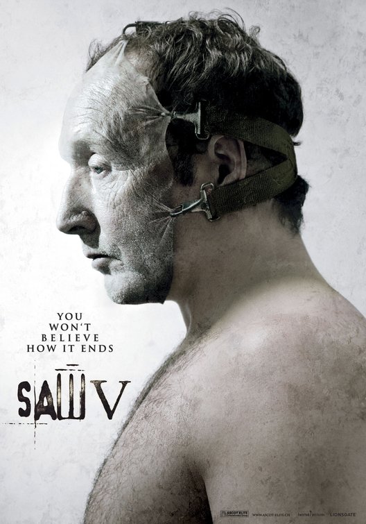
This is the saw V poster that was released before the official poster, this is to create suspense for the audience so they anticipate what the official poster is going to be like, it will make them excited to watch the film in the cinema.
Saw V Main Poster

Final Destination 5 Teaser Poster
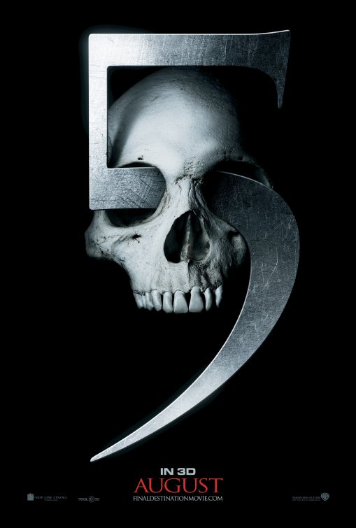
This is the final destination 5 poster that was released before the official poster, this is to create suspense for the audience so they anticipate what the official poster is going to be like, it will make them excited to watch the film in the cinema.
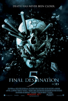
Final Destination 5 Main Poster
Deconstruction 1
Here is my deconstruction of a real film poster, Inception;
Film Poster Deconstruction by emma on Scribd
There are many conventions of a movie poster I am going to embed a image of the conventions that are displayed in the inception poster above;

Deconstruction 2
Here is my deconstruction of a real film poster, Shutter Island;

There are many conventions of a movie poster I am going to embed a image of the conventions that are displayed in the Shutter Island poster above;

Software Training
For this part of the task we had to create our own move poster as practice for making one for our short film. In order to do this we had to use Photoshop as part of the software to create the posters. I needed to practice using Photoshop because it is a piece of software that I have never really used before and I am therefore not very confident with it. I needed to practice so I could build up my confidence in preparation for creating my own film poster form our short film.
Steel Tongs
Steel Tongs is a font used to create a credit block at the bottom of a film poster. The credit block includes things like; visual effects by, edited by, directed by, produced by, costume by etc. Here is an example of steel tongs used in a film poster;

Attempt 1 - Romantic Movie Poster
Here is the instructions we had to follow in order to create our romantic movie poster;

For this part of the task we had to create a mock romantic movie poster to get some practice using the software. We had to attempt to blend two photos together to make it look like one photo. The line where it is blended needed to be unnoticeable so it looked professional. We also had to add text on our posters using the font styles and we also had to create a credit block at the bottom using Steel Tongs font. Here is my attempt at the romantic movie poster;

For my first attempt I think I have done a good job. however there are a few things that I think I could have done better, such as;
- The blending could have been done better. For example, the two pictures are too close together when I blended them so it looks like the woman's face is cut off a little bit. I should have made the top picture a little bit higher to get the effect I wanted and to make it look more professional.
Here is my second attempt at creating a movie poster in order to create this I had to follow a tutorial, here is the tutorial I had to follow;
This task, again allowed me to practice with using the software Photoshop. We had to attempt to incorporate two backgrounds together into one photo. We had to add the soldier to the sky background and then attempt to blend his legs into the black background. We had to bring all these three things together in order to create a photo that looks like one image. We, again had to use steel tongs in order to create the credit block at the bottom of the poster. Here is the finished product;

Overall I think that my war movie poster is very good for my first attempt. However, there is one improvement that I would make if I were to do it again.
- The one thing I would change is the credit block. A credit block should be quite long, it should show all of the people that have been involved in the creation of a film. A credit block could also show the production companies involved and any other work that they have done. It also shows the cast that are involved in the film. My credit block is very small and doesn't look right as credit blocks are generally longer and have more people mentioned in them.
Film Poster Target Audience
A part of our research for our main product we have to create and produce a target audience profile (TAP) and also research some similar films to our short film Grief, to look at what their target audience is. This will give us a better idea about who to aim our film poster at and who our preferred target audience will be and also the age ranges of people who watch those kinds of films.
Below I am going to embed some examples of films that are similar to our short film Grief which is a 12A.
The Notebook

If I Stay


The Notebook
Title - The Notebook
The notebook is a drama, the same as our short film is so therefore I thought it would be a perfect match for our short film Grief. Also 15-24 is around the age range that we were looking for for our short film and this is around that age range with 15% of people that like and view the notebook. Therefore I thought it would be perfect for my research into finding the perfect target audience for our short film Grief.
If I Stay
Title - If I Stay
If I Stay is a drama, the same as our short film Grief. Therefore I thought it would be the perfect match for our short film. Also 12-14 is the age that we are looking to aim Grief at and this film has 11% of people who have viewed and liked this film. Therefore I thought it would be perfect for my research into finding the perfect target audience for our short film Grief.
50 First Dates
Title - 50 First Dates
50 First Dates is a romance which is also another thing we wanted to capture in our short film Grief. We wanted our short film to be a mixture of drama and romance. Therefore I thought 50 First Dates was the perfect film to talk about in the research for my target audience as it is a mixture of both drama and romance. Also 12-14 is the age that we are looking to aim for with our short film and 50 First Dates has a percentage of 9% of people who like and watch this film. Therefore I thought it would be the perfect film to talk about in the research for my target audience.
We also created an emaze on our perfect target audience;

We also had to create a Target Audience Profile (TAP) along with our research which is a profile of the type of person we would like for our target audience for our short film Grief. Here is our TAP;
Tap by emma on Scribd
Movie poster Flat plan
Before we can create our very own film poster for our short film Grief, we have to plan it out first, we need to plan what we are going to do, where we are going to put things and what we want our poster to look like. Here we have come up with a flat plan that outlines what is going to go where on our final film poster and we have also created a rough draft of what we hope our poster will look like when we have finished.
Here is the flat plan;

Here is the rough design for our poster;

Credit Block Research
The credit block is a very important part of the film poster, it is the product of detailed legal agreements and contract negotiations. Here is an example of a credit block;

Teaser posters, however, don't feature a credit block, for example, this poster for the film Elysium;

This teaser poster doesn't have a credit block because, producers and directors of the film want people to focus more on the title and the main image rather than distracting them from that with a credit block. Most of not all teaser posters don't include a credit block. Another reason that they don't have a credit block is because they don't want to give too much away about the film like the actors names or the producers names before the film has even been released.
The design of credit blocks is done in a way that doesn't clutter the poster but makes sure that members of the team are fairly credited, therefore the text is tall and highly condensed.
The first name in a credit block is usually the presentation credits which generally recognises the films distributor. A lot of film posters put the distribution company first as they feel it is one of the most important aspects.
Film Poster Construction
I am now going to take you through the construction of our film poster, from what it looks like when we started to what it looks like at the end.

The first thing we did was add the background colour to our poster. For our poster we opted for a simple background colour because we thought that simple looked the most effective. Therefore it was very easy to do because we just added a grey colour to the background layer using the colour fill tool.

The next part of the film poster was to cut Marc out from the original background and impose him onto the grey background. This was much harder to do because it took precision, we had to get rid of all of the original background from around Marc, using the quick selection tool, to ensure that it didn't look like he had just been photo shopped in we wanted to make it look like he was already part of the background.

After adding Marc into the background, we then had to add Ellie into the same background next to Marc. Again this was much harder to do because it took precision, we had to get rid of all of the original background from around Ellie, using the quick selection tool, to ensure that it didn't look like she had just been photo shopped in we wanted to make it look like she was already part of the background.

After adding both Marc and Ellie into the background layer we took Ellie as her own layer and added a layer mask. We did this because we wanted to add an effect of Ellie fading out and the only way to do this was to add a layer mask to the existing layer. We then used the gradient tool and chose the option foreground to transparent option;

We then dragged the line from where we wanted Ellie to start fading out and where we wanted Ellie to stop fading out.

After doing the harder stuff we then started adding the text to our poster. The first thing we added was the names of our actors. We found this quite difficult because we couldn't find a text that represented our film and that fit well with our poster and also a font size that wasn't to small that couldn't be seen but wasn't too big that it didn't fir on the poster.

After adding the names of the actors we added the title of our short film. This was fairly easy to do, however, we needed to find a font style that represented our film perfectly. When you think of the work Grief you think about someone grieving for a loved one and you think of something quite sad which we wanted to represent through our title.

We then moved on to adding the credit block, this was very easy to do because we used steel tongs and then added the names of people who were involved in the production and in the making of our film. We also made the text black because we felt it fit well with the rest of our poster and also fit well with the genre of our film.

We then needed to think of a tagline to add onto our poster that represented the overall plot of our film. We finally decided to add 2 quotes from the film that didn't give the story away too much but got people guessing as to what it might be about. We also decreased the opacity of the text to make it look like it is fading out just like Ellie is.

We then added the star rating at the top of the page, this gives the audience an idea of what the film is like and whether the film is worth watching or not.

Finally we added another layer to the poster. We then used the gradient tool and used the foreground to transparent option. We then dragged it from where we wanted it to begin and where we wanted it to end. This created a darker effect at the bottom of the poster and then faded into a lighter effect at the top of the page. We feel like this added a little bit more to the poster and stopped it from looking too plain. It broke up the monotony of the plain grey background.
Completed Draft | Film Poster

Film Poster Feedback and Evaluation of Feedback
When exhibiting the first finalised draft of our film poster we received quite a lot of feedback from peers and from our teacher. Our magazine review was exhibited on the main blog, with a link to padlet where anyone from our class could give us some feedback or constructive criticism. Receiving the feedback allowed us to see which areas of our film poster were our strongest and which areas of our film poster were the weakest, we would then go and improve the weaker areas of our film poster to a higher standard.
Here is the feedback we received on our film poster;

We are going to get rid of the quote at the bottom of the page and add a quote that isn't from the film, we are still going to add a quote that makes the audience empathise with the characters but we will think of one that isn't part of the film to make the poster look more original.

We are going to get rid of the quote at the bottom of the page and add a quote that isn't from the film, we are still going to add a quote that makes the audience empathise with the characters but we will think of one that isn't part of the film to make the poster look more original.

We will move the stars down and closer to the text of the actors names. We will therefore keep the fade as we feel it fits in perfectly with the theme of the rest of our poster and we feel like it fits in with the storyline of our film.

We will get rid of the spaces between the credit block to make the poster look more professional.

We have missed out a couple of our crew members names so in the improved version of our poster we will add in the missing names, because after researching real media texts and looking at real film posters they all have the names of all of their production team and because we want to follow the conventions of real film posters we will make that improvement.

In the improvements we will add in the name of a newspaper that gives films star ratings. This will make the poster look much more professional and also get more people watching our film because they know that we have been given a genuine star rating by a newspaper company and that we haven't just made it up.

We are going to get rid of the quote at the bottom of the page and add a quote that isn't from the film, we are still going to add a quote that makes the audience empathise with the characters but we will think of one that isn't part of the film to make the poster look more original. We will also use a quote that doesn't give too much away about the film or the storyline.

In the improvements we are going to start again with cutting Marc out of the background. We will zoom in to the image while we are cutting him out to get us to see the edges more clearly and get right to the edge of the image. This is going to refine the edges much more and therefore make the poster and the image look much more professional and make it look less like a layer.

We are going to play around with the background colours for our poster, however, we are still going to go for the plain and simple look because we feel like it looks very effective. With a background image, such as, trees or scenery we feel like the whole poster looks too crowded so we are going to stick with the plain background but we will have a play about with the colours to see if we can find a colour that goes with the genre of our short film while making the poster stand out.
Construction of Improvements of Film Poster and Final Film Poster
I am now going to take you through the construction of the improvements of our film poster, from what it looks like when we started to what it looks like at the end.
The first improvement we made to our film poster is adding the name of the newspaper that gave our poster the four star rating. In the first version of our poster we just had the four star rating without naming the newspaper that gave it to us. This would be very confusing for the audience as they aren't able to reference the four stars to anything. The people who see the poster might think that we have just made it up. However, by adding the newspaper company the four star rating is reliable. This is going to make more people want to watch the film as it has been given a genuine star rating of four and is therefore worth watching.
The next improvement we made to our poster is the font colour and the font style. In the original version of our film poster, the font was black and the font was very blocky and very hard to read especially because the size of the font was very small. The new font we used is much easier to read and also fits with the genre and storyline for our film. We also changed the font because originally it was black but we decided to change the font to white because we felt like the black font faded into the background a little bit and there was too much black already in the poster so we didn't want to add anymore. We therefore decided to add a white font which we feel stands out much more and breaks up the monotony of the black colour throughout the poster.

The next improvement we made was the actual quote we used. Originally the quote we used was from our short film. From the feedback we received, we realised that by using a quote from our short film was unoriginal. We therefore decided to change the quote to something that isn't necessarily in the film but gives the audience an idea of what the film is about without giving too much information about the storyline away which we feel is very effective and creates a sense of empathy with the characters straight away before they have even watched the film, which already builds up a relationship between the characters and the audience.
The next improvement that we made to our magazine review was the credit block. In the original version of our magazine review we didn't add all of the names of our production team into it which doesn't look very professional because in real media products that i have looked at all of the production team is listed in the credit block so we had to change that to make the poster look more professional. Another thing that we changed in the credit block is the spacing between the texts. In the original version the credit block had a lot of spacing issues which made the poster look very unprofessional so we therefore had to back and change it.

The next improvement we made was the image of Marc. In the original poster the image still had a little bit of the background around the image of Marc when we cut him out of his original background and added him as a new layer onto our poster. This made the poster look very unprofessional. In the improved version I cut Marc out of the background again and started from scratch and the background is no longer visible around the image of Marc making the poster look much nicer and look much more professional.
Further Improvements
After completing the improvements for out magazine review we got some further feedback and then we made some more changes according to the feedback we got.
The first improvement we made was changing the tagline. The other taglines we came up with were just quotes from the film which weren't very inventive and didn't really link to the overall story line of the film, so we decided to change the tagline to something more original and inventive. We did some research on some real media films and looked at their taglines and we gained inspiration from those and then updated our tagline with help from other real film taglines.
The last improvement we made from our further feedback was the credit block. The first thing we did was get rid of the large gaps between the lettering which made it look unappealing and took peoples attention away from the rest of the poster. The next thing we did was change the colour of the credit block. The original colour of the credit block was black which we feel blended in with the rest of the poster too much because there were too many black and grey colours. To break up the monotony of this we decided to change the credit block to white which added an extra colour to the whole poster and also made it stand out.
Completed Final | Film Poster
